Power BI • Sports Analytics • IPL (2008–2025)
IPL Analytics Dashboard
Team, Player & Season Insights
A fan-first yet business-grade analytics dashboard on the Indian Premier League, built in Power BI to answer one simple question: what really drives success in the IPL across seasons?
Story: From Cricket Fan to Sports Analyst
I’ve followed the IPL like most of us do – emotionally. But as a data analyst, I wanted to go beyond “CSK vs GT banter” and actually quantify performance across teams, seasons, and players. This project is my attempt to bring a structured, analytics-first lens to IPL history using Power BI.
The goal was to design a dashboard where a casual fan, a fantasy league player, or even a sports strategist could quickly answer:
- Which team has been the most consistent across seasons?
- How do Orange & Purple Cap winners influence team results?
- What does a “championship season” look like in numbers?
The result is an interactive IPL Analytics Dashboard (2008–2025) that combines team standings, batting & bowling stats, and season-wise trends into a single view.
Problem Statement
With 15+ seasons of IPL data, it’s hard to see patterns just by looking at tables or scorecards. Every season has new teams, auctions, and player dynamics. Fans and analysts need a way to cut through the noise and understand performance at a macro level:
- Which teams dominate the league table and why?
- How do batting and bowling awards correlate with team success?
- What are the high-scoring seasons and formats of play?
Project Objectives
- Build a single-page IPL overview for quick storytelling.
- Track Champions, Runners-up, total 4s/6s, centuries and matches.
- Highlight Orange Cap & Purple Cap winners with team context.
- Show a dynamic points table that updates with season selection.
- Design the page so it feels like a broadcast-style sports panel, but powered by data.
Dataset & Modelling Approach
I used season-wise IPL match and player statistics (batting, bowling and team results) and modelled it in Power BI as a clean semantic layer:
- Match-level table – season, teams, venue, result, total 4s, 6s, centuries, winning margin.
- Team table – team names, logos, abbreviations (used in points table visual).
- Player stats table – season-wise runs, wickets, 4s and 6s for Orange/Purple Cap logic.
- Season dimension – used as the main slicer for toggling 2008–2025 views.
In Power BI, I used relationships on Season and Team, and created DAX measures for aggregate KPIs (total 4s, total 6s, matches, centuries, points, etc.) so the entire page responds to a single Season dropdown.
Dashboard Walkthrough
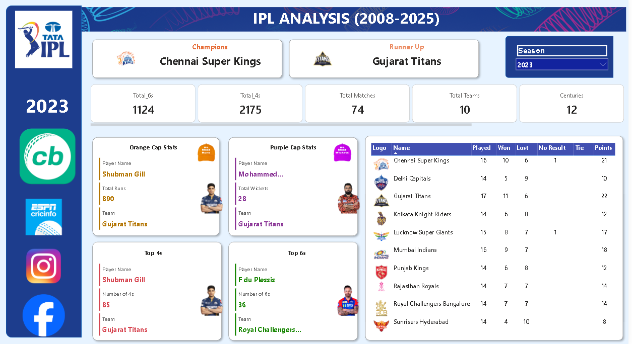
🏆 Title Bar & Season Context
The top band, labelled “IPL Analysis (2008–2025)”, sets the context with:
- Champions – e.g., Chennai Super Kings.
- Runners-up – e.g., Gujarat Titans.
- Season selector – dropdown to switch between seasons.
📌 Core KPIs
Directly under the header I show summary tiles for the selected season:
- Total 6s hit across all matches.
- Total 4s hit.
- Total matches played.
- Total teams participating.
- Number of centuries scored.
👑 Player Spotlight Cards
The middle section focuses on star performers with IPL-style “cap” tiles:
- Orange Cap – player name, total runs, franchise.
- Purple Cap – bowler, total wickets, franchise.
- Top 4s and Top 6s – aggressive batters with boundary count.
These visuals make it easy to see who carried the batting and bowling load for each season.
📊 Points Table
On the right side, a points table visual (matrix/table) tracks:
- Team logo and name.
- Matches played, won, lost, and no-result.
- Ties and final points.
This reflects the official IPL points structure and allows a quick sense of who dominated the league stage.
Key Insights & Patterns
- Run-heavy seasons: Some seasons clearly stand out with significantly higher counts of total 4s and 6s, hinting at flatter pitches and power-hitting eras.
- Champion consistency: Teams like Chennai Super Kings frequently appear near the top of the points table even in seasons they don’t win, underscoring squad depth and strategy.
- Orange/Purple Cap impact: In many seasons, the team with the Orange or Purple Cap winner also finishes in the top 2–3 positions, showing how star performance correlates with overall team success.
- Competitive balance: The spread of points often shows tightly packed mid-tables, reflecting a highly competitive league where small margins decide playoff spots.
What This Project Demonstrates
This IPL dashboard is more than a fan project – it highlights my ability to:
- Convert raw sports scorecards into an analytics-ready data model.
- Design broadcast-style dashboards that still obey good BI practices.
- Use DAX and relationships to keep everything driven by a single Season selection.
- Tell a clear
data story that is accessible to both fans and business stakeholders.
Explore the Dashboard Yourself
Use the dropdown to switch seasons, track champions, and see how star players shaped their team’s journey.